Album Cover Collages
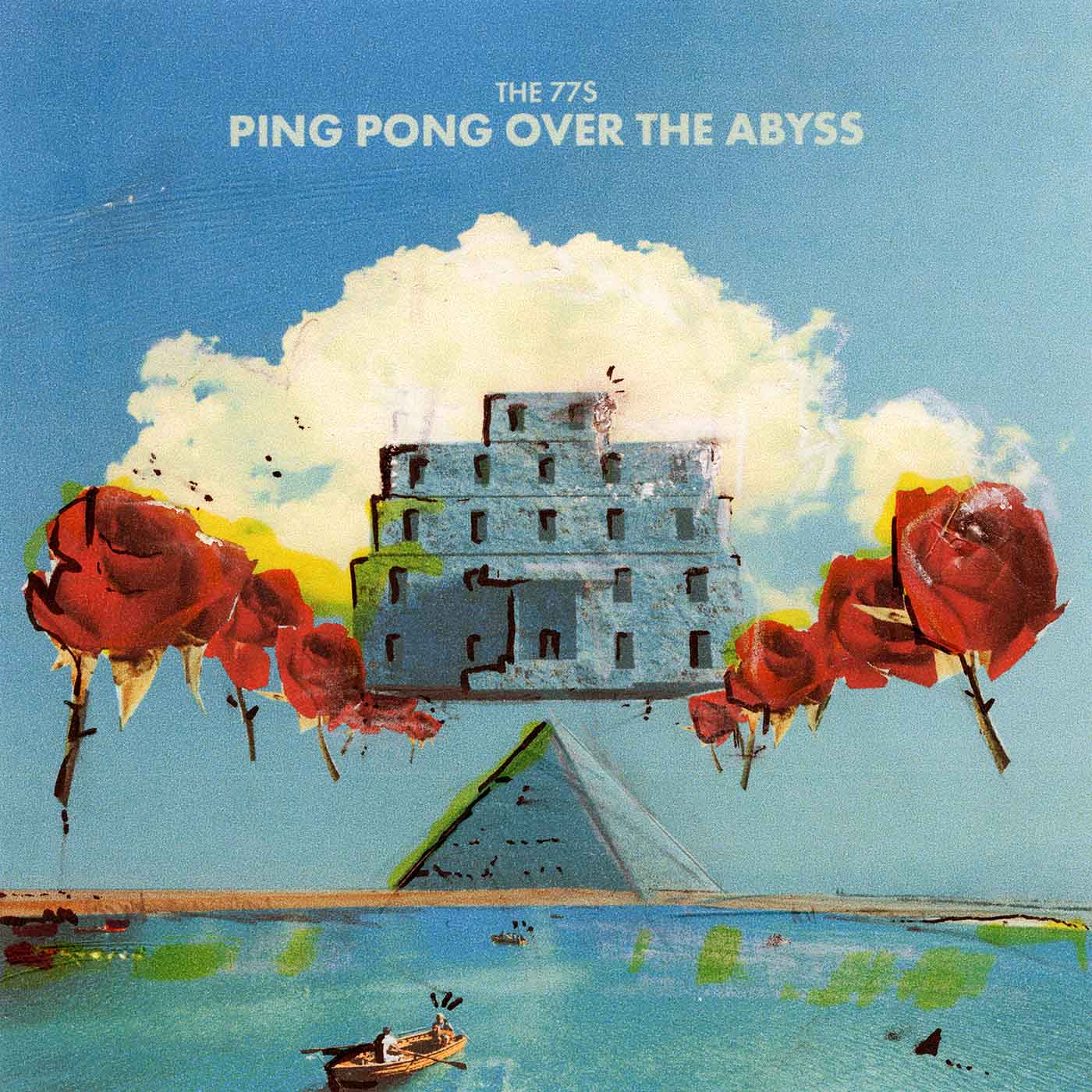
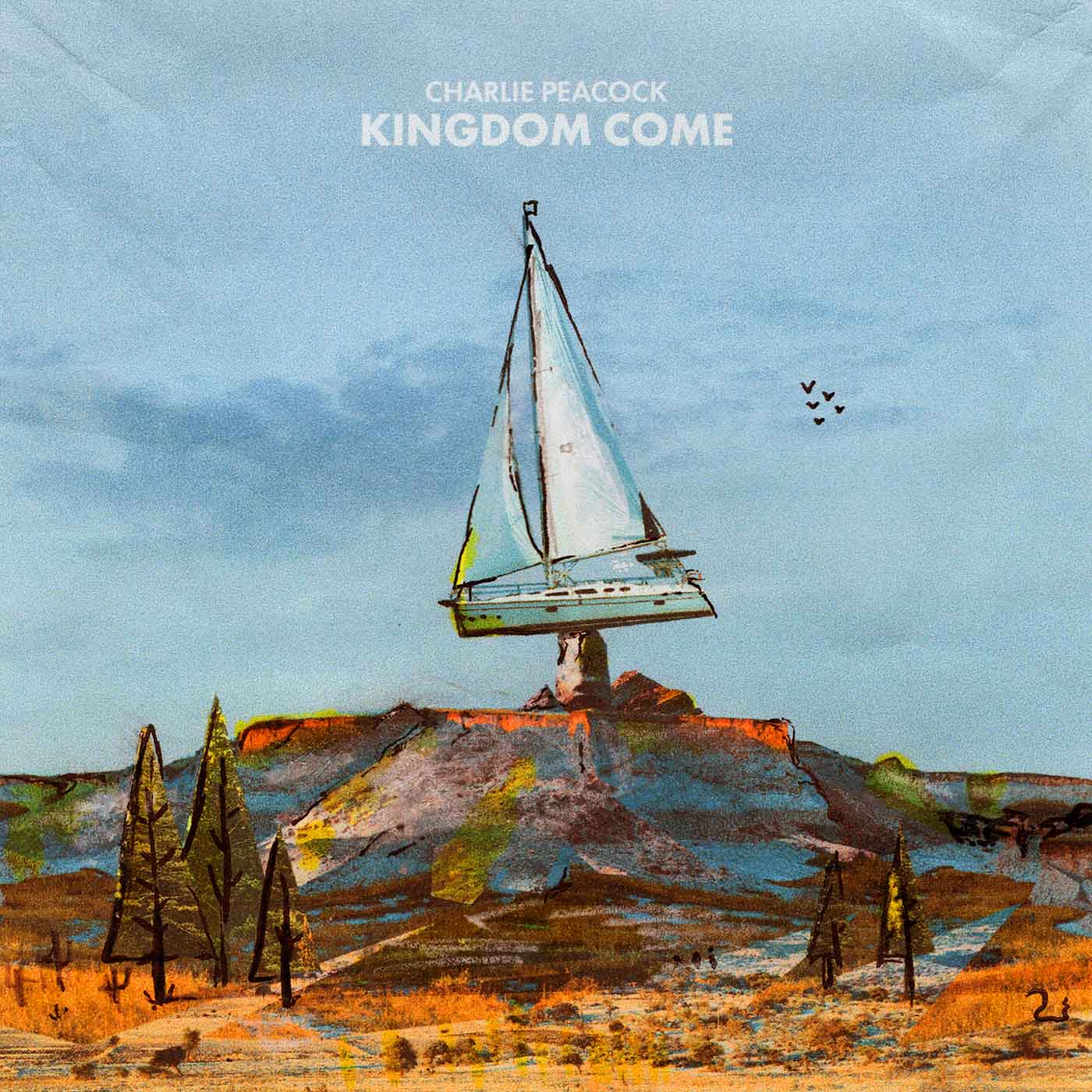
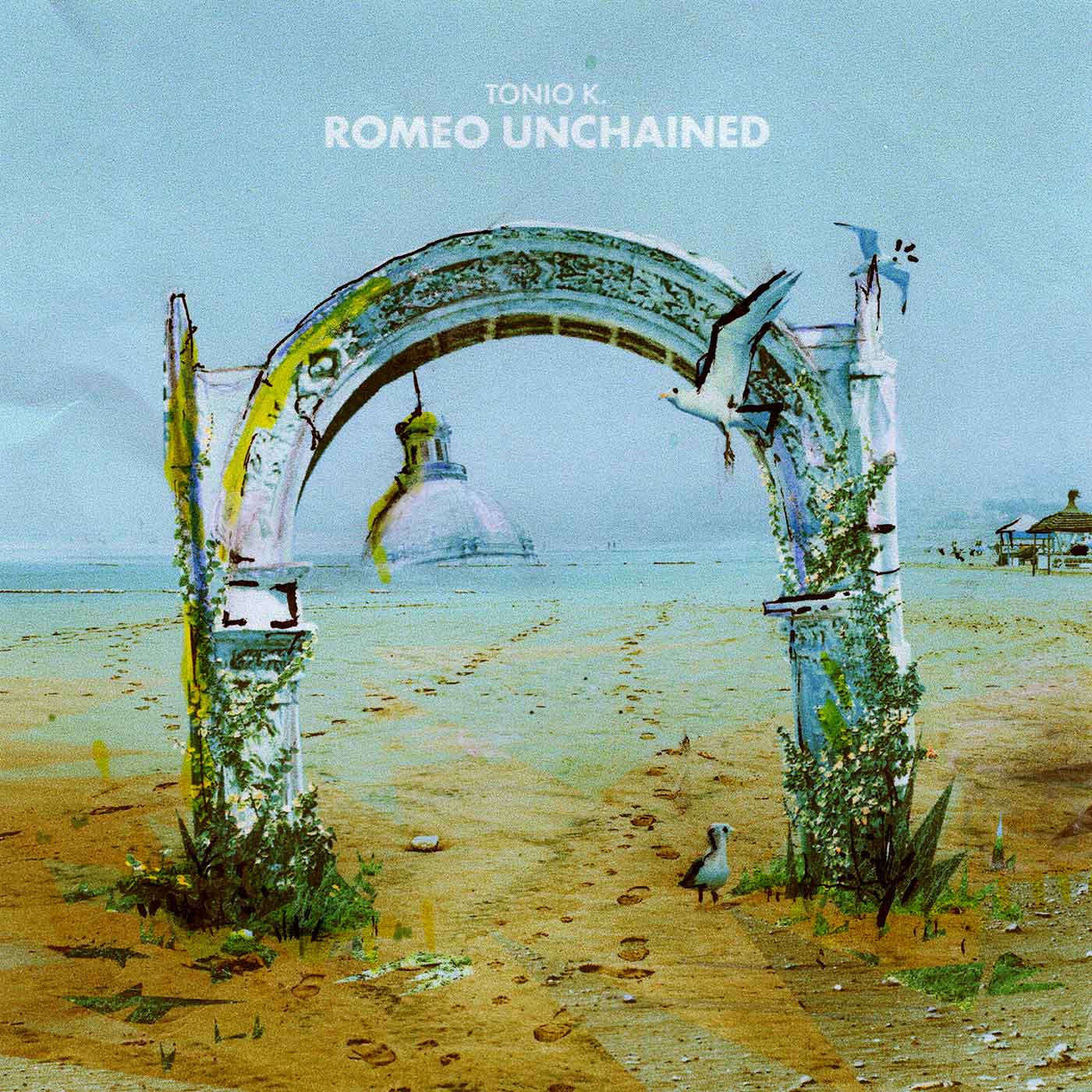
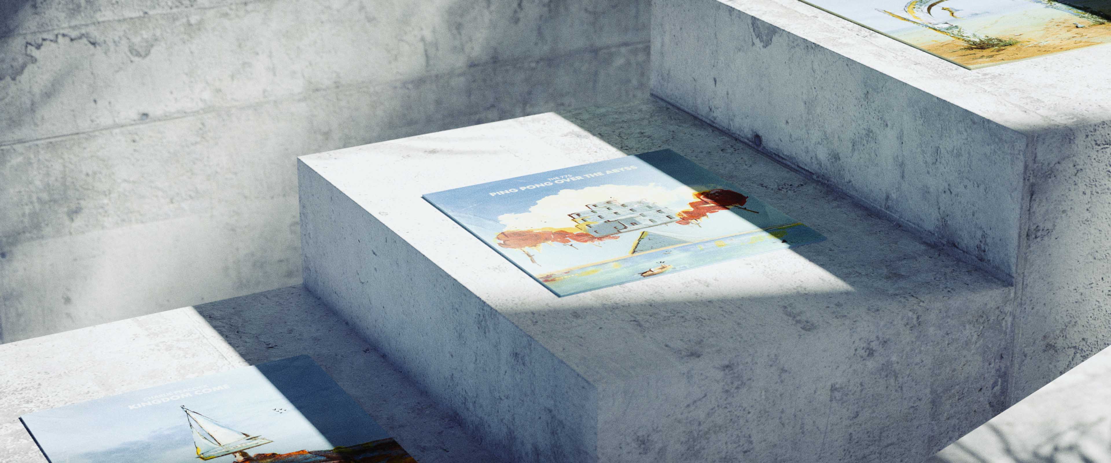
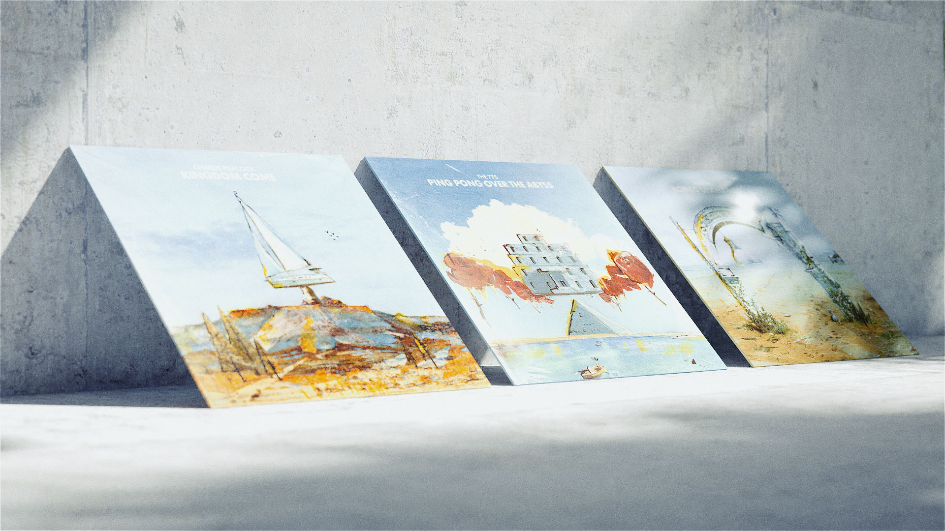
Three album covers for a project exploring process.
04-11-2021
Both art styles had great emphasis on the creation process. They wanted to tap into that subconsciousness, invoke automatism, and create spontaneity. That’s all a very fancy way of saying that they wanted to find the unexpected.
I asked my dad to pick three albums he liked when he was younger. After some research on each album, I came up with these rough photoshop composition sketches.
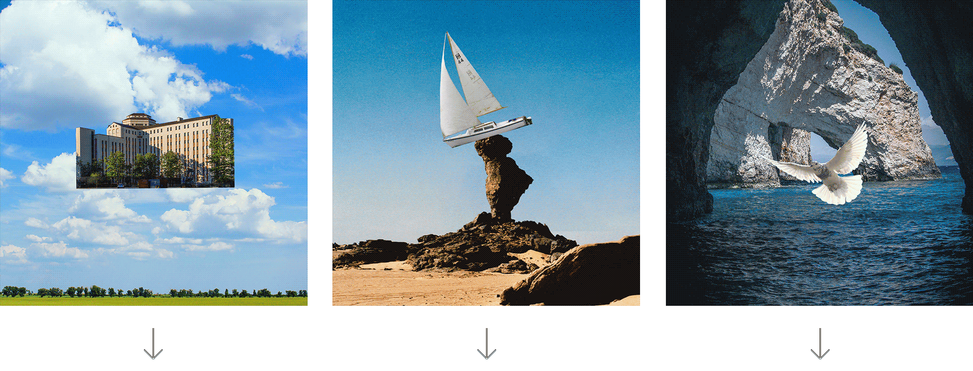
I then called up my dad and described each sketch I had made. He then drew what I had just described over the phone. He told me, "you're not going to like these!" and I was like, "no, no, it's fine, I don't need anything perfect, this is the process."
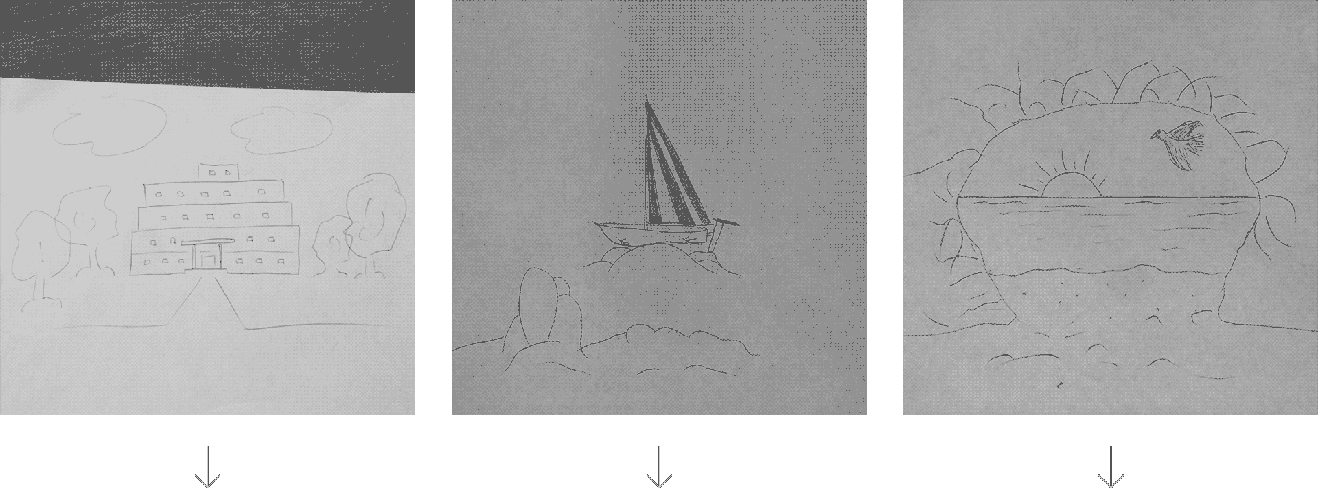
I then took his drawings and used them as a template to re-interpret from. For example in the first, the pathway he drew I re-interpreted it into a pyramid.
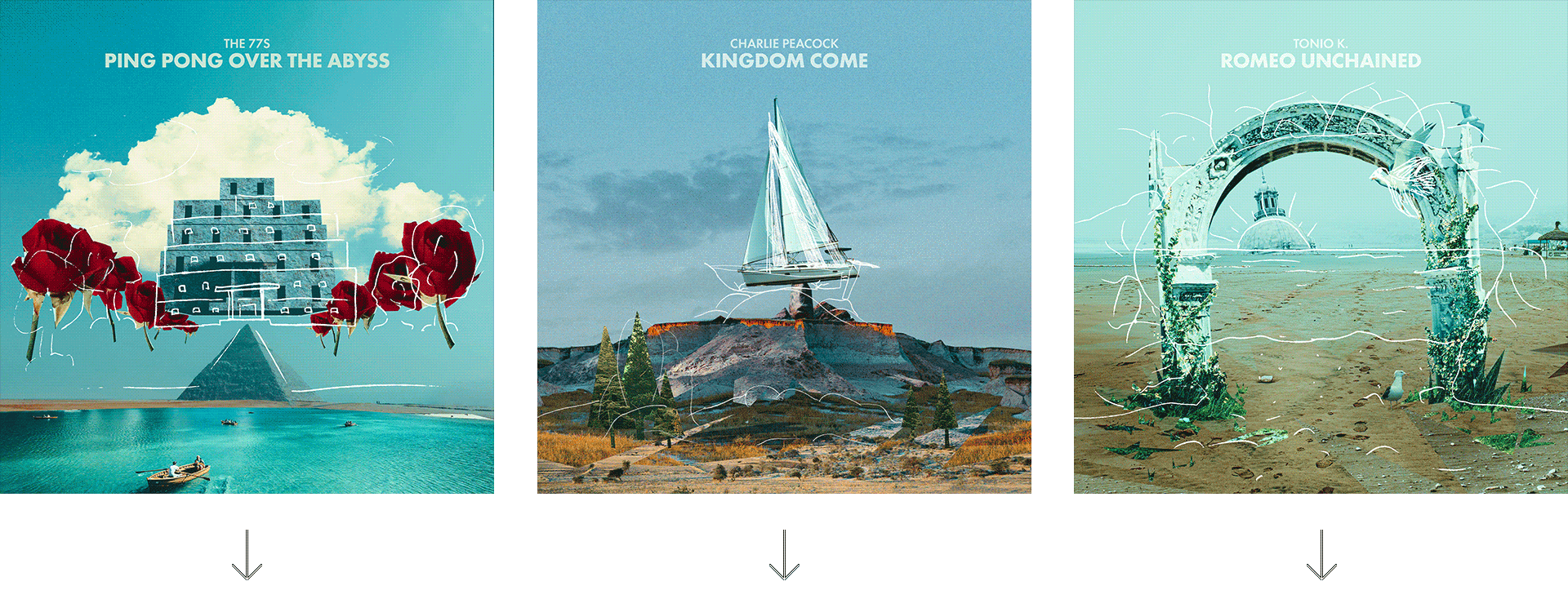
After said roughening, I scanned them back in. Here are the final pieces. I went from an idea sketch, to verbally describing, to my dad's interpretation, to my final re-interpretation. While creating these, I allowed as many "mistakes" as possible in the processes to happen. All in lieu of the creation process of the surrealist and dada artists.
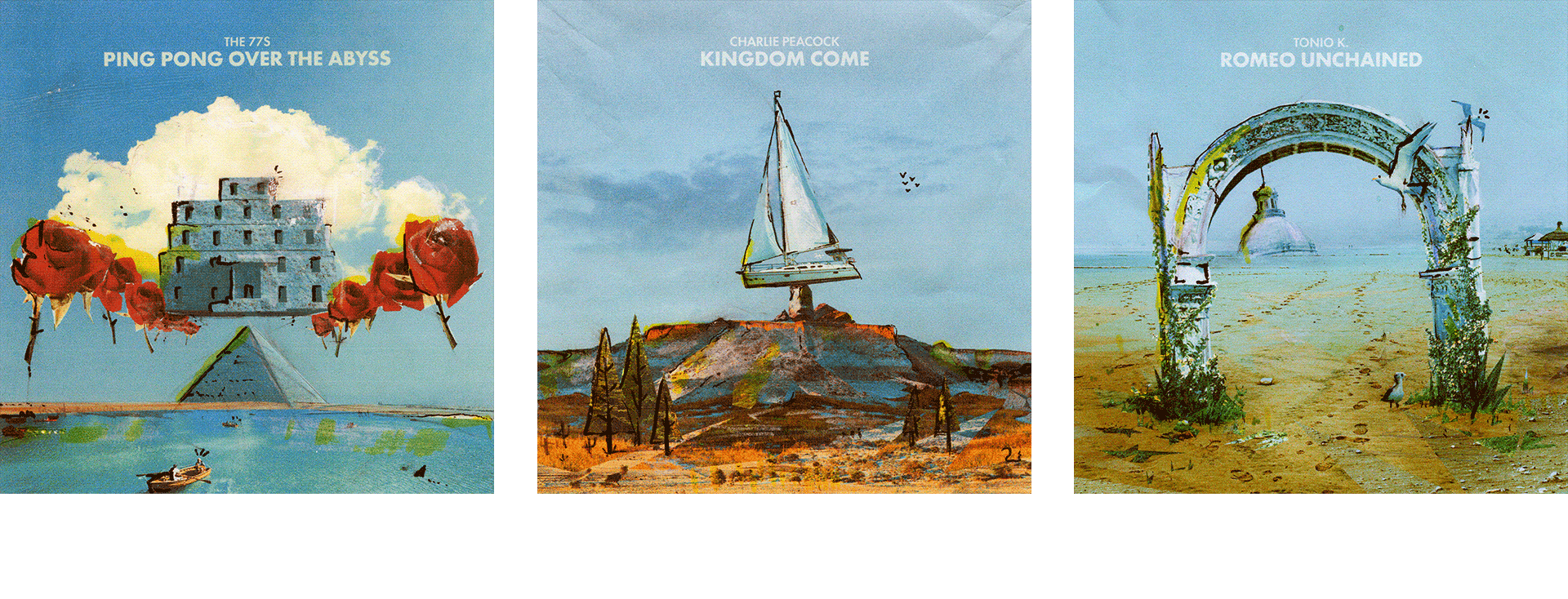
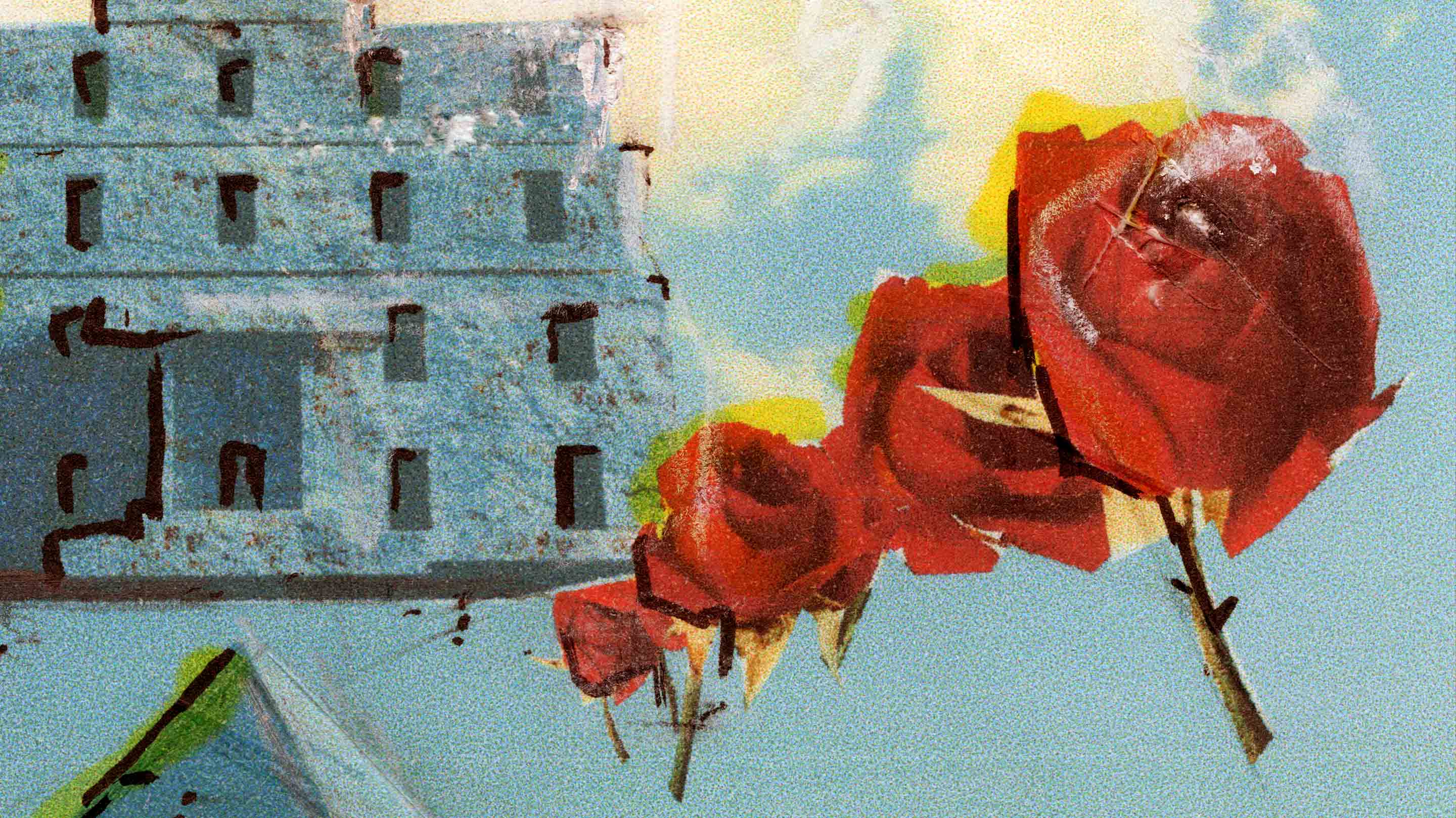
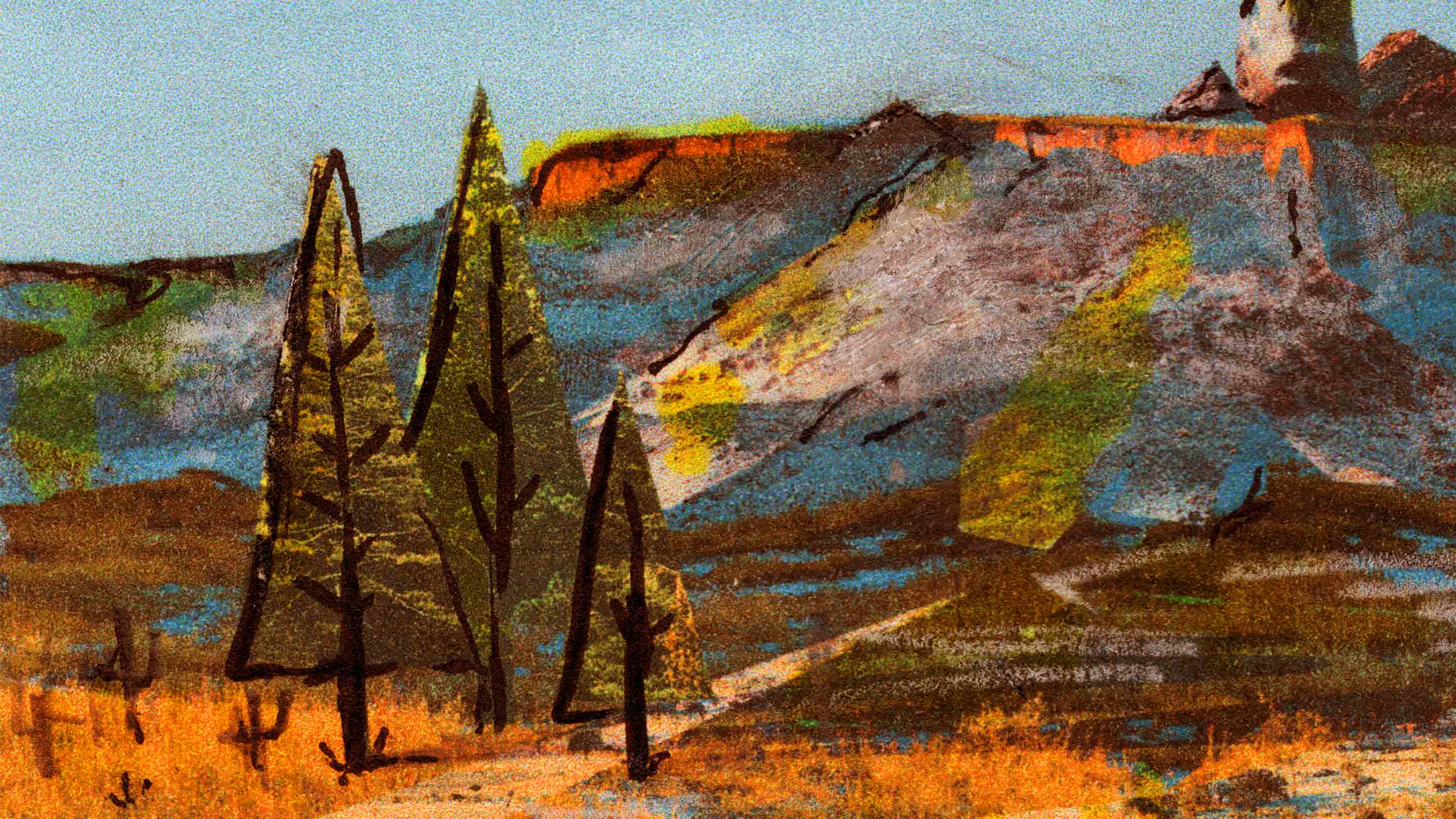
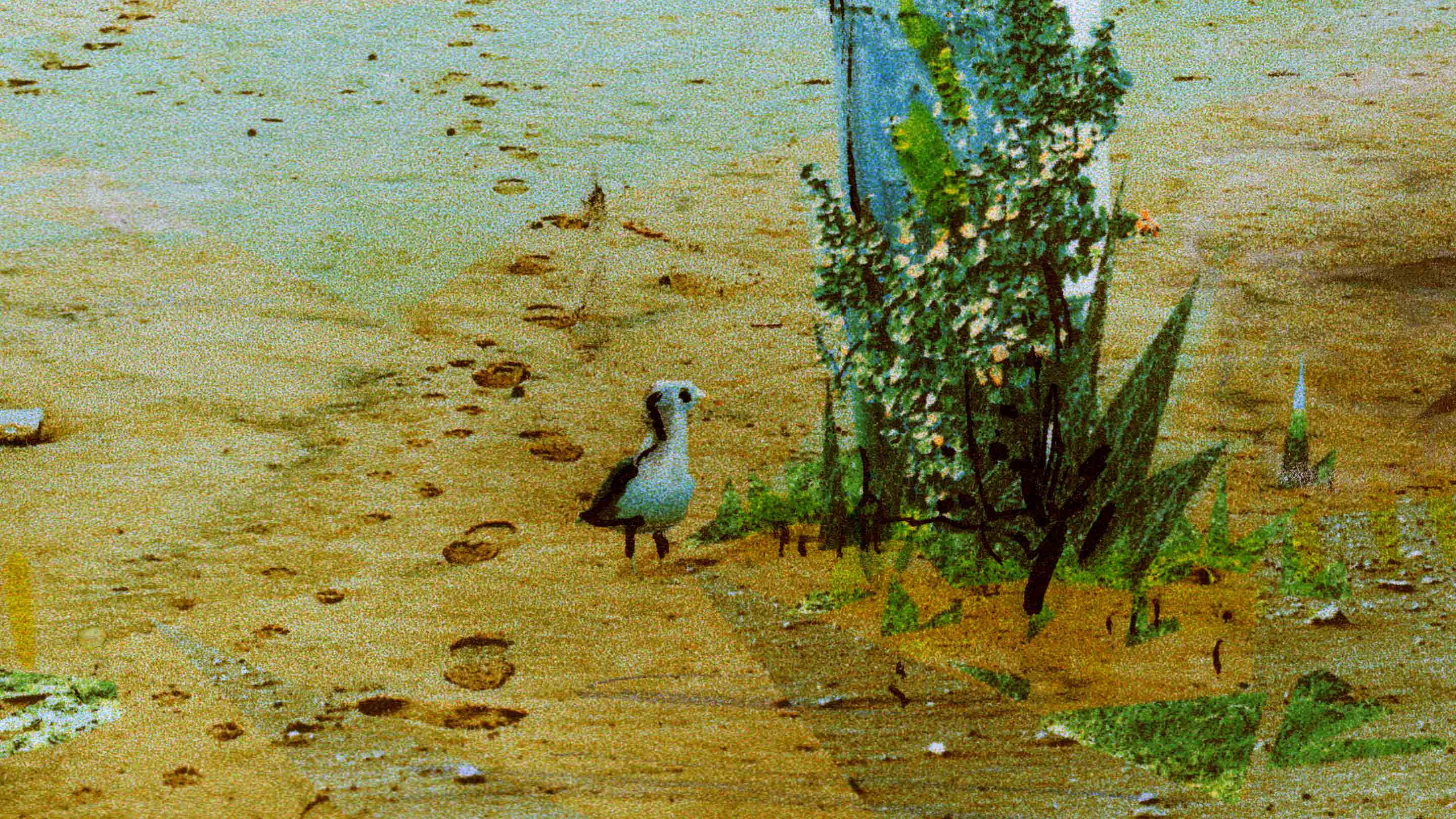
Here are some close-ups of the finals.
