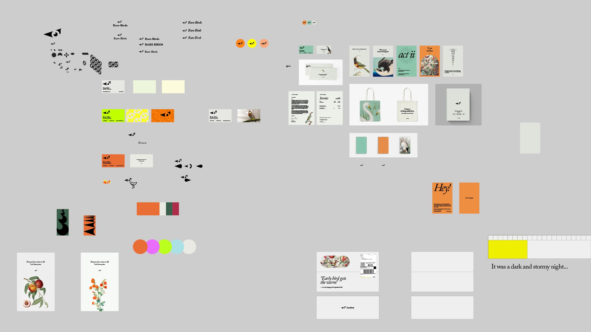
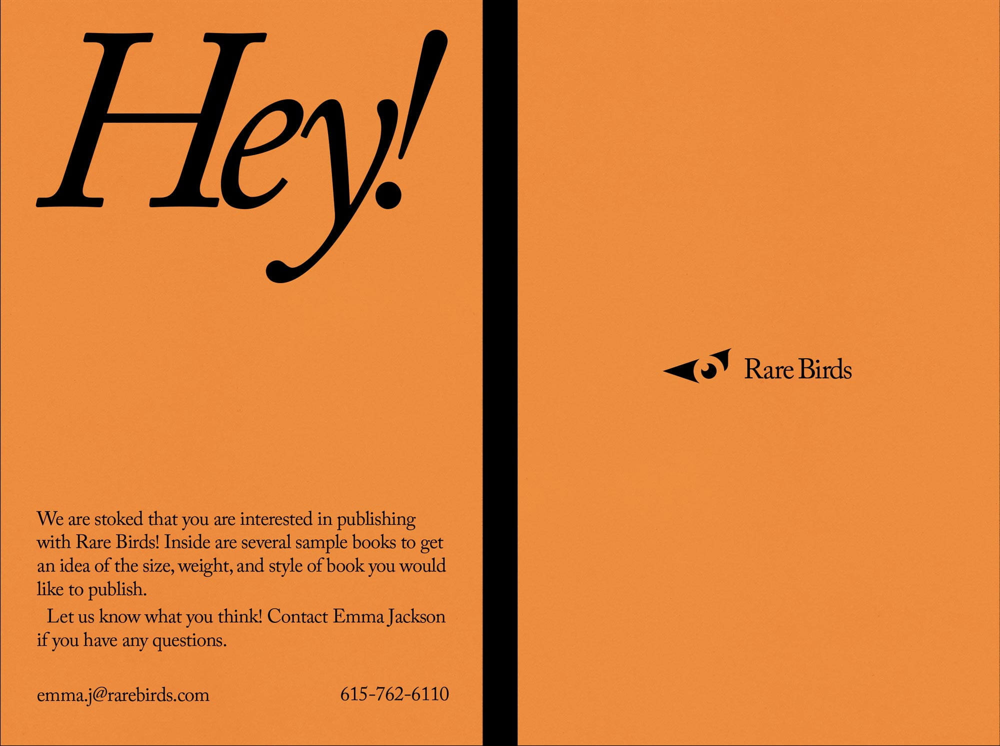
Branding for Rare Birds
Rare Birds, a publishing company, branding.
04-15-2021
Rare Birds love books, but more specifically a good story. Everything they do reflects their passion and love for a written adventure. Writing a novel takes time, but more importantly, effort. Sitting on a towel on the beaches of Hawaii for an entire day would take time, but not much effort.
The point here is they aim to be the helping hand in that process of creating a book. None of that cheesy, wacky social media "inspirational" posts. Honesty should be their middle name. The designs and overall branding they put out should have that level of honesty; they are saying they are here to help when an author needs it.
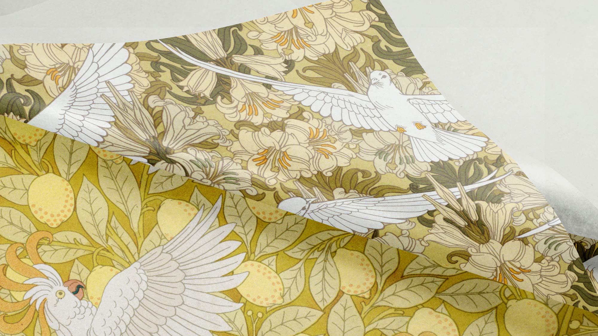
Rare Birds like to incorporate patterns subtly. Tissue paper inside a box, for example, is an elegant use of these kinds of patterns.
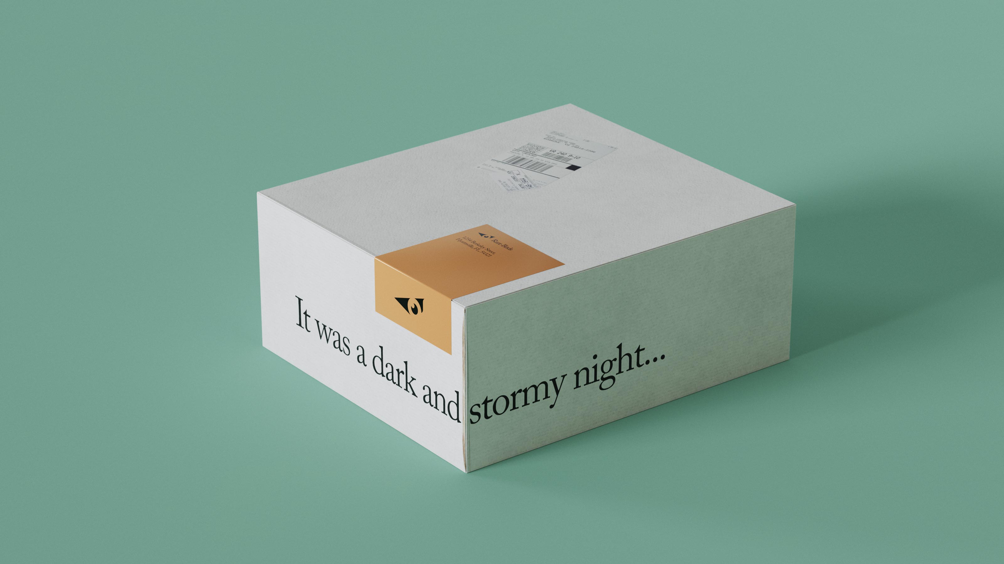
In the box there's a personalized card on printed cardstock.
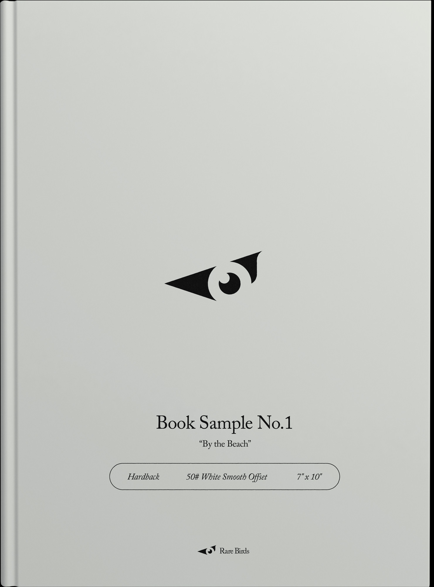
For some larger authors, they can receive a sample(s) of book size, bind, weight, font, etc.
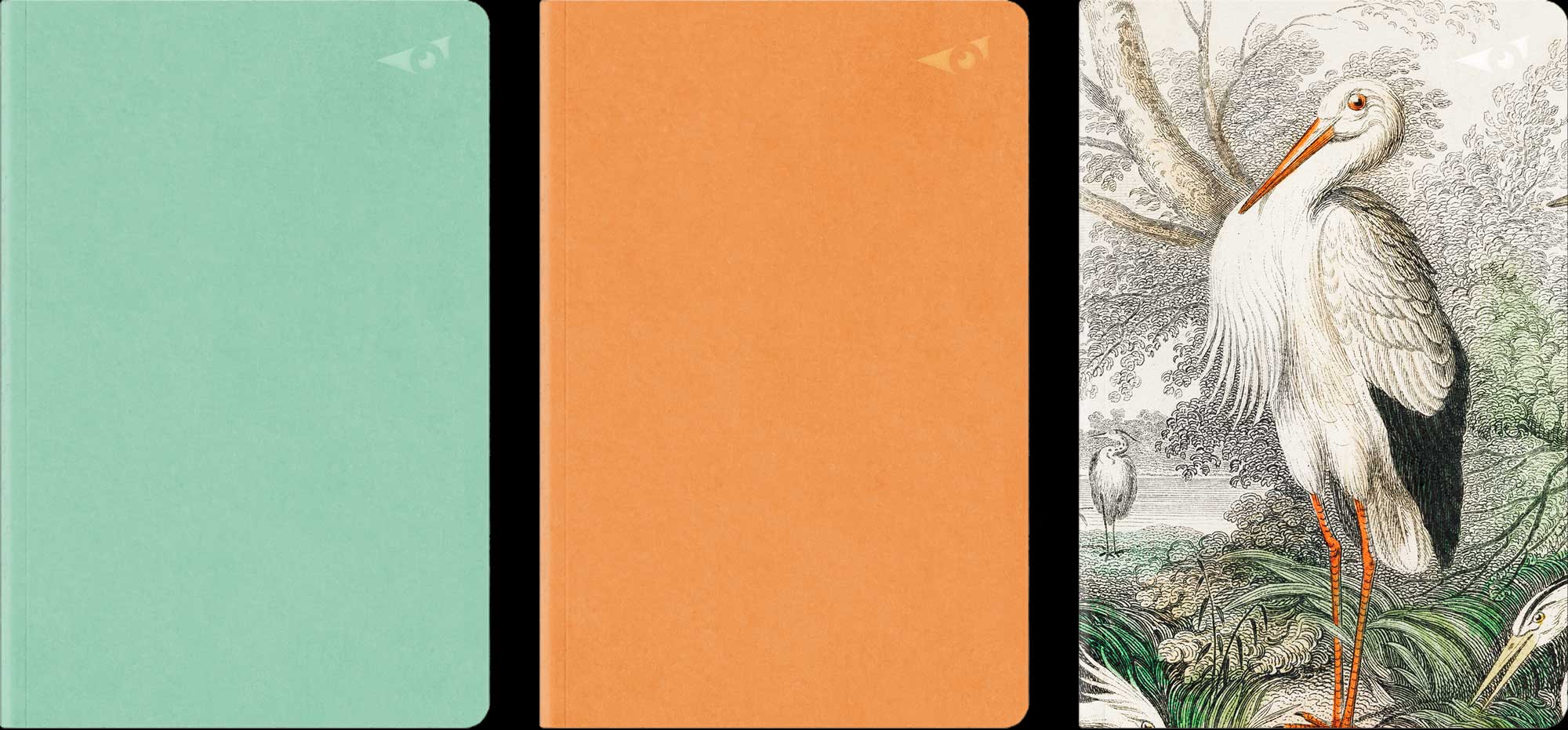
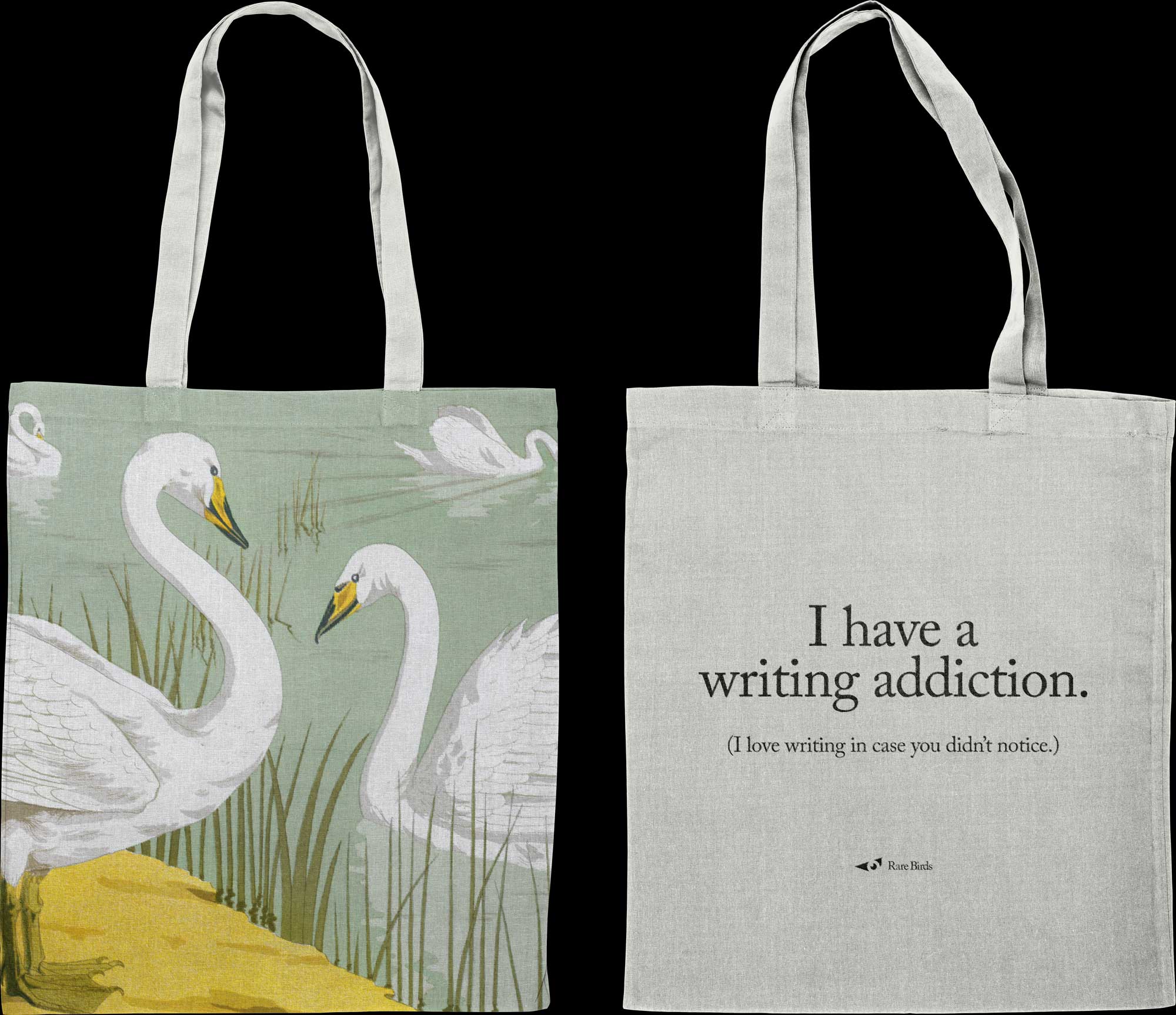
Here are examples of a gift or product. Some of our top clients get sent goodies like these every once in a while. A notebook that is clean and simple with the logo embossed and spot-gloss. And a tote bag for carrying books!
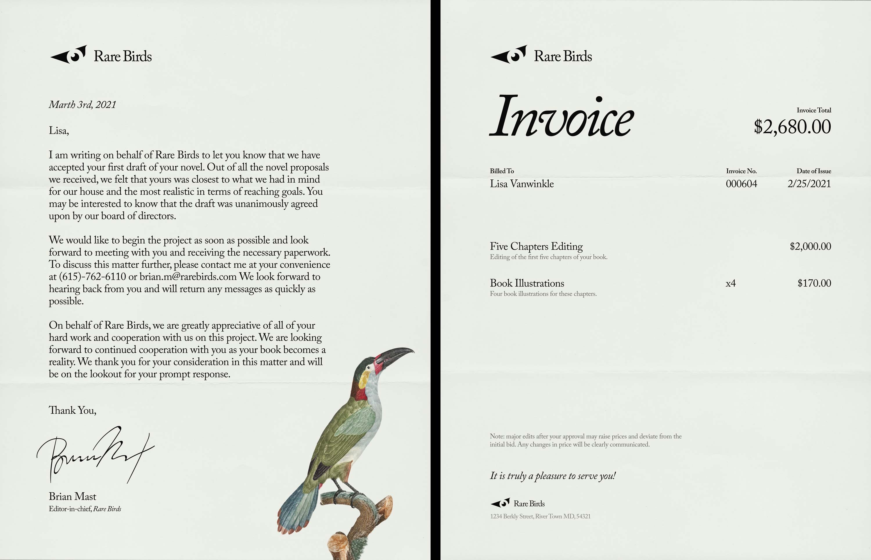
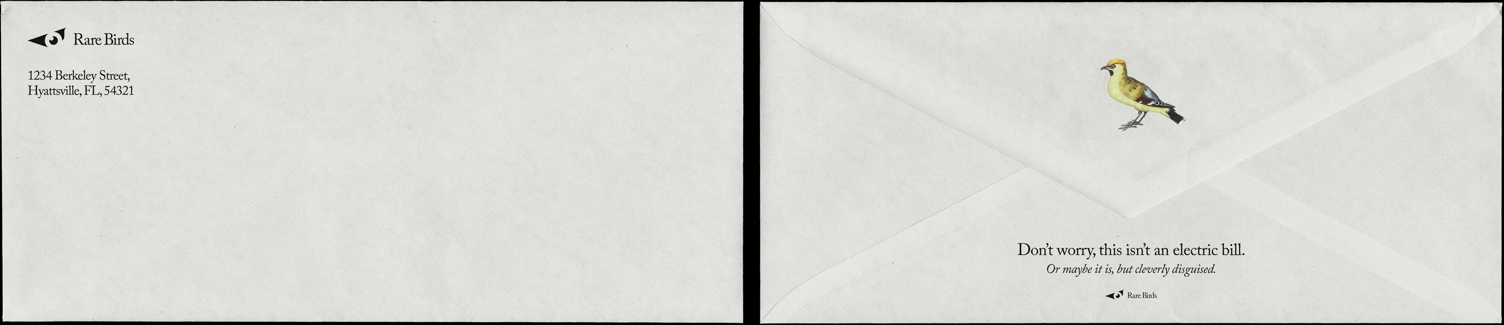
For letterheads, it is simply the logo. This can be used in all cases, such as an invoice. For more "exciting" items, like a letter, they will have alternative paper templates that include an illustration near the bottom. These colorful letterheads would not be used on invoices, for example. They don't want to be like, "YAY, FUN! PAY US!" Rare Birds is a fun company, but also takes things seriously.
View the Brand Guide
Here are my initial sketches for the logo for this brand. Lots of ideas being put onto paper.
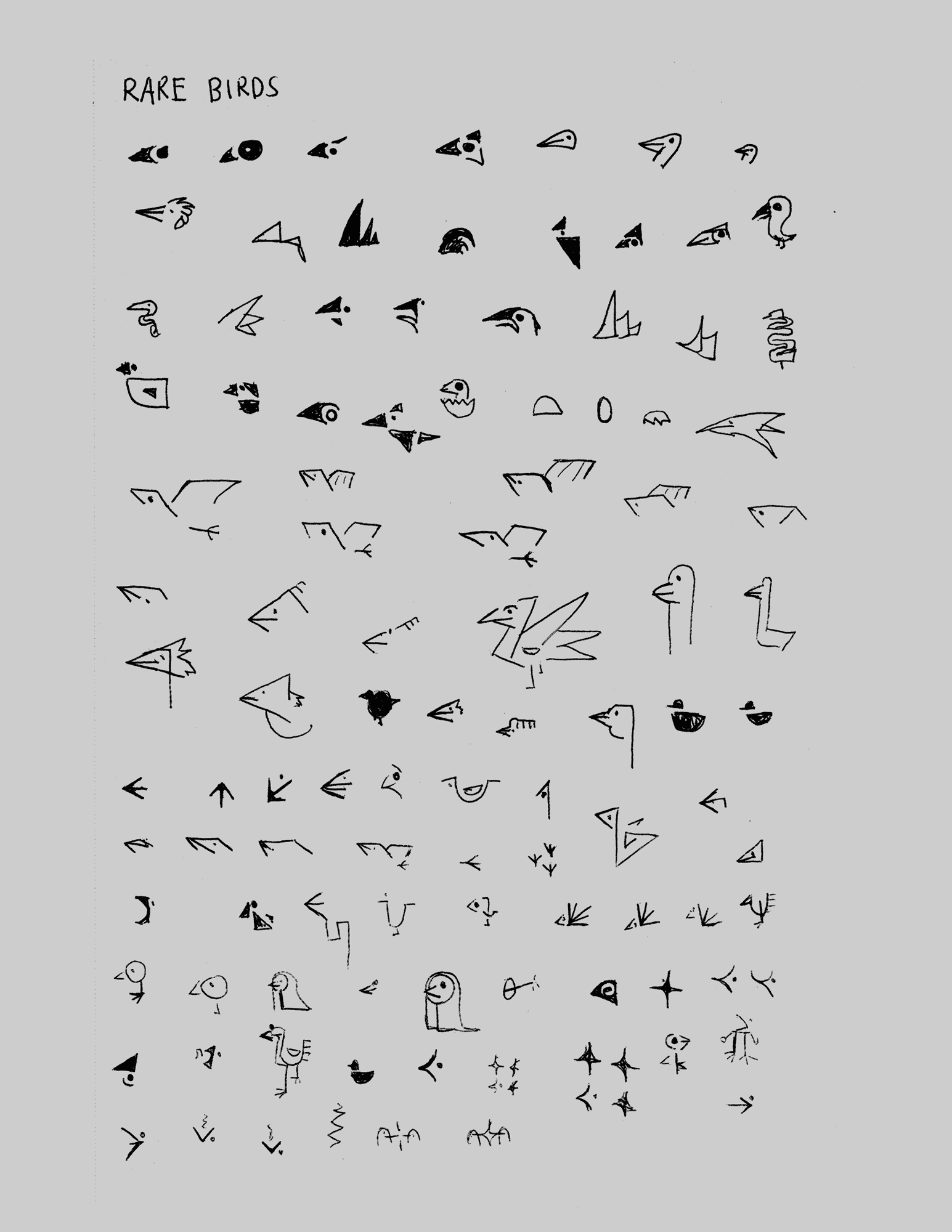
Starting to build out some of the ideas.
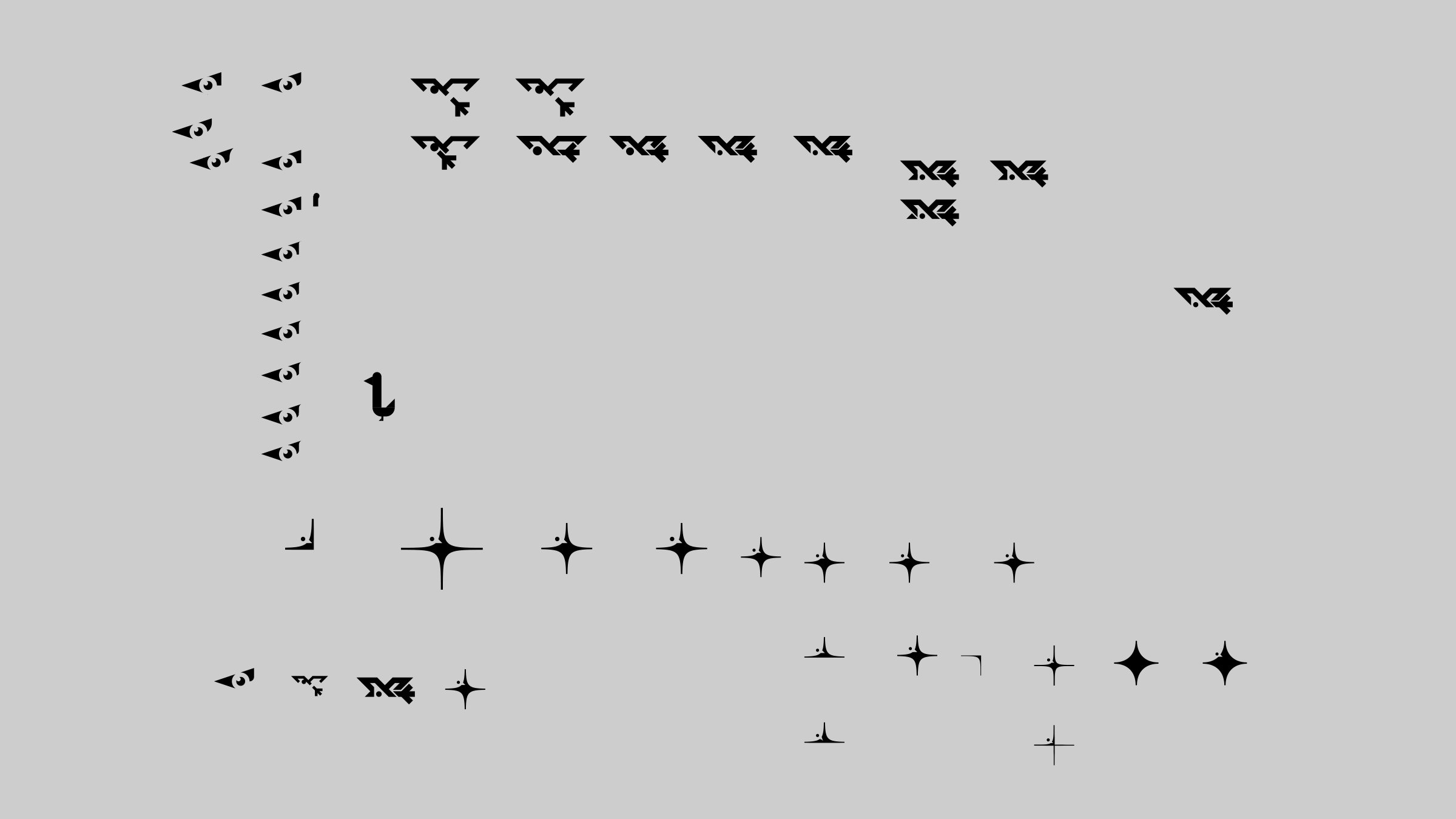
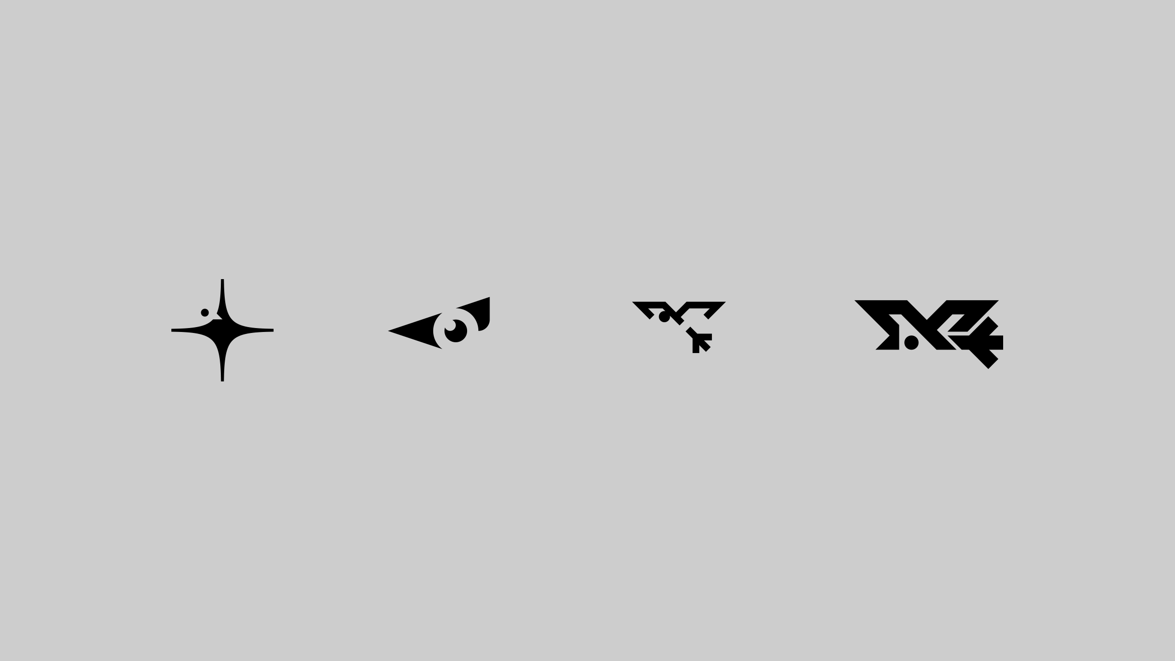
The second was the most liked and obviously is the one I fine-tuned. There were comments about how the back of the head wasn't looking right, so I adjusted that shape.
The third and fourth were said not to match the style as much. Too much like an outdoor sportswear or skate company. Does anyone want to hire me to brand your bird-themed skate company?
Exploration of the brand as a whole. Lots of play and testing. Images are from the public domain. Messy, but that's how I think.